You are using an out of date browser. It may not display this or other websites correctly.
You should upgrade or use an alternative browser.
You should upgrade or use an alternative browser.
Evaluate my ''graphics''
- Thread starter Geo
- Start date
Magna
New Member
One thing I would like to point out is that your signature is too big, please resize it and read the rules for the sizes >.>
Anyway, I like it, even though I'm not a Rockman fan.
I can't really rate because it depends on exactly what it's being rated/ compared to if I make sense >.<
Anyway, I like it, even though I'm not a Rockman fan.
I can't really rate because it depends on exactly what it's being rated/ compared to if I make sense >.<
GSR
That one guy
Remove sig, put images in post. Well, I think the Warrock one can stay, I'm pretty sure that's under the limits, but Subaru's gotta go.
That being said, they're good. Better than I could do, probably. One thing I've always wondered: where do people get those fancy sig backgrounds? Do you just make them with brushes or what?
That being said, they're good. Better than I could do, probably. One thing I've always wondered: where do people get those fancy sig backgrounds? Do you just make them with brushes or what?
Evaluate my graphics xD
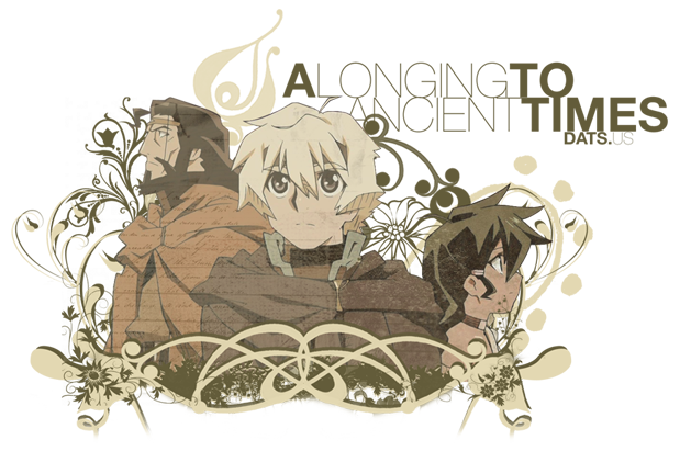
Well let's start. Fonts i'm not really experient with them so i use simple ones, about the renders (the image of the guys) just search them...and choose one with quality that's what i do, sometimes wallapapers and official websites got some..about my signature instead of subaru img i putted the link, i guess ist's smaller now..
Note. GSR, yes that blackground u see is all madden with brushes, and blick well i guess some still match exemple warrock has blue parts and i putted blackground in blue colors, since it has "green" i putted font in green colors too. Anyway keep commenting

Rein
The Mysterious Stranger
You can use art, it's all the same.
I don't like the font either and the fact that the War and the Rock are so far apart from eachother. It gives off a disconnected fealing. Did you put a stroke around the scan? If you're going to do that (usually to conceal bad extracting) use a color similar to the background. Speaking of the backgrounds, I like them a lot, but they should match the colors of the characters a bit more, unless you're going for a colorless-ness with a splash of color look.
Also, Planet-Megaman = best place EVER for high quality megaman scans.
I'll agree that War/Rock are too far apart, but I like the background. It's subtle and works for me. I'd shrink down the height a bit to make it more rectangle, but that's a personal preference for me (As you can tell by my sig xx; ). Other than that looks fine to me.
digiboy123
Sub Editor & RAW Scan Provider Purdy Thing
I like it. Simply put.
The font is appropriate and it works, imo. Good job.
The font is appropriate and it works, imo. Good job.
Wanted1992
New Member
I like them very much, especially the Subaru one it looks very cool. And you know, you are inspiring me to show my talent  so I shall post my pics ASAP.
 so I shall post my pics ASAP.
Royal_Knight
Gallantmon
i hate to go aganist most everybody, but i think they're quite nice.
The text text in the subaru one needs to be different...or something.
& "war rock" is kind of far apart.
just keep trying, you'll get the hang of it.
The text text in the subaru one needs to be different...or something.
& "war rock" is kind of far apart.
just keep trying, you'll get the hang of it.
AznxLoneWolf
Member
I think the new one's very nice ![Smile :] :]](data:image/gif;base64,R0lGODlhAQABAIAAAAAAAP///yH5BAEAAAAALAAAAAABAAEAAAIBRAA7) . Ichigo is cool ^ ^ and the colors fit nicely together. I probably can't do much better so I won't criticize
. Ichigo is cool ^ ^ and the colors fit nicely together. I probably can't do much better so I won't criticize ![Smile :] :]](data:image/gif;base64,R0lGODlhAQABAIAAAAAAAP///yH5BAEAAAAALAAAAAABAAEAAAIBRAA7) ...because, you know, I don't think anyone who can't do better has a right to.
...because, you know, I don't think anyone who can't do better has a right to.


