You are using an out of date browser. It may not display this or other websites correctly.
You should upgrade or use an alternative browser.
You should upgrade or use an alternative browser.
Signature opinions.
- Thread starter johnxfire
- Start date
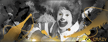
Constrictor
Spirit Evolution
Ok if you want easy opionion I can say they are pretty good.
For serious opinion (Skip of you don't want to read)

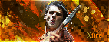
Main character (Subaru) is to blury. That's make him less important in your signature. Color theme blend together so that also make Subaru more less important. Best background color for light green object should be green too or red (maybe orange) light blue is good also.
The position where you place brushes and lines anre in good position. Good job.
You test XFire is to dark. Someone may miss the text too.
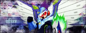
Again, you shold make your main character more important than background (Also text that color is to similar to background)
But the abstract background is nice. Compare to your sig right now. Your current signature is great example for text.
But is your signature style is blury I can't complain that
End of my opinion.
NVM you have rotating signatures. - -"
For serious opinion (Skip of you don't want to read)
Main character (Subaru) is to blury. That's make him less important in your signature. Color theme blend together so that also make Subaru more less important. Best background color for light green object should be green too or red (maybe orange) light blue is good also.
The position where you place brushes and lines anre in good position. Good job.
You test XFire is to dark. Someone may miss the text too.
Again, you shold make your main character more important than background (Also text that color is to similar to background)
But the abstract background is nice. Compare to your sig right now. Your current signature is great example for text.
But is your signature style is blury I can't complain that
End of my opinion.
NVM you have rotating signatures. - -"
celestial_sacred
Active Member
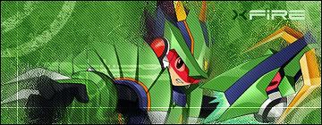
I agree with Constrictor. ^^
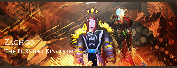
About the first one, I think it's okay to make Subaru blurry, EXCEPT for his face and a little around it.
About the first one, I think it's okay to make Subaru blurry, EXCEPT for his face and a little around it.
AznxLoneWolf
Member
^ I agree. Much better than the first two ![:]](data:image/gif;base64,R0lGODlhAQABAIAAAAAAAP///yH5BAEAAAAALAAAAAABAAEAAAIBRAA7 "Smile :]") .
.
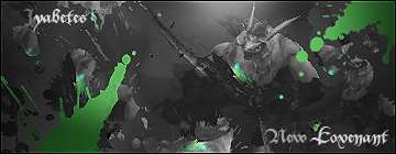
.Constrictor
Spirit Evolution
Good job !
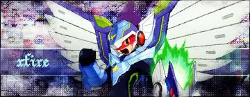
But the your second signature text is still to hard to read
But the your second signature text is still to hard to read
celestial_sacred
Active Member
Oh wow! Nice~ It looks better now! But I think both of the characters need to be a little bit brighter so they don't sink into the background.
I think the "outstanding-ness" of the text depends on the artist. Maybe johnxfire doesn't really want "xfire" to be that noticeable. If he wants it, then it really needs more touch.
But I think both of the characters need to be a little bit brighter so they don't sink into the background.Constrictor;16828 said:But the your second signature text is still to hard to read
I think the "outstanding-ness" of the text depends on the artist. Maybe johnxfire doesn't really want "xfire" to be that noticeable. If he wants it, then it really needs more touch.
johnxfire
Grand Saboteur
celestial_sacred;16869 said:Maybe johnxfire doesn't really want "xfire" to be that noticeable.
Got that right. I don't really focus on the text, but I found it a bit messy anyways.
Thanks for your opinions, guys!
Constrictor
Spirit Evolution
celestial_sacred;16869 said:Oh wow! Nice~ It looks better now!
I think the "outstanding-ness" of the text depends on the artist. Maybe johnxfire doesn't really want "xfire" to be that noticeable. If he wants it, then it really needs more touch.
I mean text blend with background to much so I can't read it easy xD
celestial_sacred
Active Member
Constrictor;16883 said:I mean text blend with background to much so I can't read it easy xD
Oh! Sorry for misunderstanding. At least it's still readable.
AznxLoneWolf
Member
Constrictor;16883 said:I mean text blend with background to much so I can't read it easy xD
Personally, I think it's more of a font issue, not a color one...or am I just missing the point?
 ;
;
celestial_sacred
Active Member
Wow. That looks neat! The lighting's a bit normal but it's good enough to me. You really love that blurry effect, don't ya? Haha
You really love that blurry effect, don't ya? HahaConstrictor
Spirit Evolution
johnxfire;16949 said:Yep. I should really try some other styles, but I'm still not sure on how to use sorta advanced stuff like clip masks with .psd files.
You never know if you never try
")